Leave a Comment
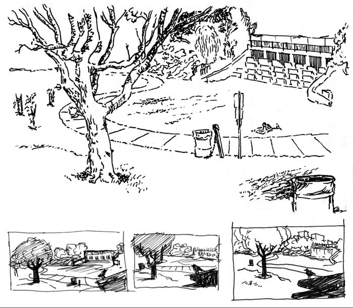
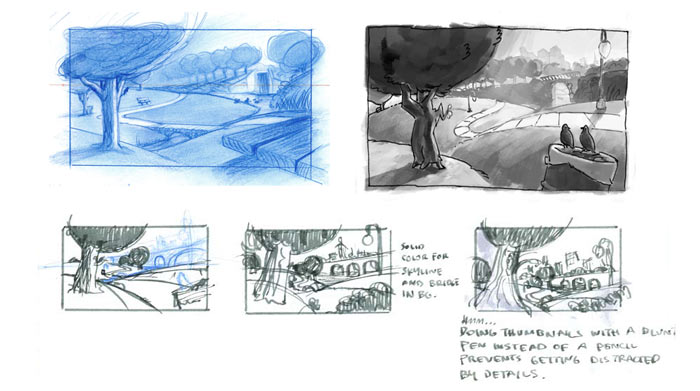
I’m trying to get used to building drawings using an incremental process, sketching and refining with loose thumbnails. Then enlarging a thumbnail to use as the basis for a larger rough.
This park scene started out as a sketch from Pan Pacific park before it diverged from reality in thumbnails to become a more idealized urban park landscape. In the two value studies I did, I kept getting sucked back into rendering detail, but after a few more thumbnails, I whittled the composition down to something simple that I cleaned up and colored in Illustrator.


man, your background designs are really progressing well. I love what you did with the complimentary color scheme for the park: you were able to say so much with just two colors. Anyways, keep up the amazing work. It really shows